Vectorising a 2012 logo
When I moved this site off WordPress
a few days ago, one thing nagged at me afterwards. The whole site was now
crisp vector and text — except the logo, which was still a PNG I’d pulled
off the old site: logo-retina.png, 542×148, a fixed grid of pixels from
2016.
On a static site with a dark mode, a raster logo is a small, persistent embarrassment. It can’t recolour, so supporting dark mode meant shipping a second PNG with the blue script manually lightened — a file I’d generated by walking the pixels and nudging the hue, which is exactly the kind of hack you notice every time you open the assets folder. It’s soft on high-density screens beyond its 2× size. And it’s opaque to the one thing this site is otherwise made of: text you can read, diff, and change.
So the logo became the migration’s last chore. Here’s how it went from a raster to a single, theme-aware SVG — and the two false starts on the way.
It’s a font
The Artetecha wordmark is a bouncy blue script. Looking at it with fresh
eyes, the letterforms were suspiciously even — the two ts identical, the
terminals consistent, the bounce regular. That’s not hand-lettering; that’s
a typeface.
The quickest way to test a hunch like this is to overlay the wordmark on likely candidates at matched size. I set “artetecha” in a handful of Google script fonts and lined them up against the PNG. One was an instant, glyph-for-glyph match: Pacifico. Given the logo dates from 2012, when Pacifico was the free script font of the moment, I’d bet money it was the original. This wasn’t “a font that gets close” — it was almost certainly the source. A vector rebuild would carry zero brand drift.
Or so I thought.
The wrong Pacifico
I grabbed Pacifico from Google Fonts, outlined “artetecha”, and it was… off. Heavier. More upright. The jaunty forward lean of the original had been sanded down. Close enough that most people wouldn’t clock it, wrong enough that I would, every day.
The culprit is that Pacifico has been redrawn. The version Google Fonts serves today is v3.001; the 2011 release — the one a 2012 logo would have used — is v1.000, and Vernon Adams’s original has a noticeably lighter weight and a stronger slant. Set the same word in both and the drift is obvious:
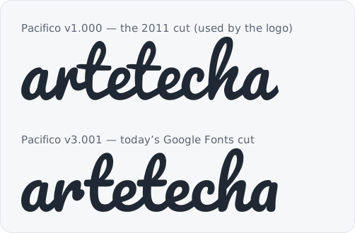
The fix was to stop using the current cut. Font Squirrel still distributes the original v1.000, under the same SIL Open Font License — which, helpfully, explicitly permits outlining glyphs into a logo with no attribution required in the artwork itself. I noted the provenance in an SVG comment anyway, because future me will want to know.
There was one more transform to recover. Laid over the PNG, even the right cut sat too narrow: the original designer had stretched the type horizontally, by about 1.39×. A quick non-uniform scale on the outlined path — wider than it is tall — and the wordmark finally dropped onto the original exactly.
Tracing three blobs
The wordmark was only ever the easy half. To its left sit three overlapping blobs — a grey pebble, a lime one, an amber one — and they are not geometric. My first instinct had been to approximate them with rounded rectangles (the same squircles I’d used for the favicon), rotated to fake the organic tilt. Up close, they read as what they were: rectangles pretending to be pebbles.
The blobs are original artwork, so the honest thing was to trace the actual shapes rather than reinvent them. I recovered the original retina PNG from git history, classified each pixel by colour into three masks, and for each blob walked outward from its centre at fixed angular steps, recording where the ink ended — a radial trace. A light pass of smoothing, then converting the sampled points into a closed Catmull-Rom curve, gave three smooth-but-irregular outlines that match the pebbles instead of impersonating them.
The tooling detour
The first attempt to outline the text produced a logo that rendered as
“arte” and then stopped dead. The path data was full of NaNs: the library
I reached for first choked on the font’s curve commands and silently
emitted garbage coordinates, and an SVG parser gives up at the first one.
Swapping to fontkit — which shapes
the text properly, kerning and all — produced clean path data on the first
run. Ten minutes lost to a library that failed quietly instead of loudly;
the usual tax.
One file, both themes
The finished logo is a single SVG: the three traced blobs in their brand colours, and “artetecha” as outlined paths, composed in the same 542×148 coordinate space as the original so every proportion carries over. It lives in the repo as a small Astro component, and there’s a standalone copy at /logo.svg.

The part that finally retired the dark-mode hack: the script’s fill is a CSS custom property.
<g fill="var(--logo-script, #1c6398)"> … </g>Steel blue in the light theme, a lighter steel in the dark — one variable, flipped by the same mechanism that themes the rest of the site. The blobs keep their colours in both. No second PNG. No recolouring script. About six kilobytes instead of two raster files, crisp at any size, and legible as plain text in a diff.
Which is the whole point. After the migration, the site was a folder of files you could read. Now the logo is too.